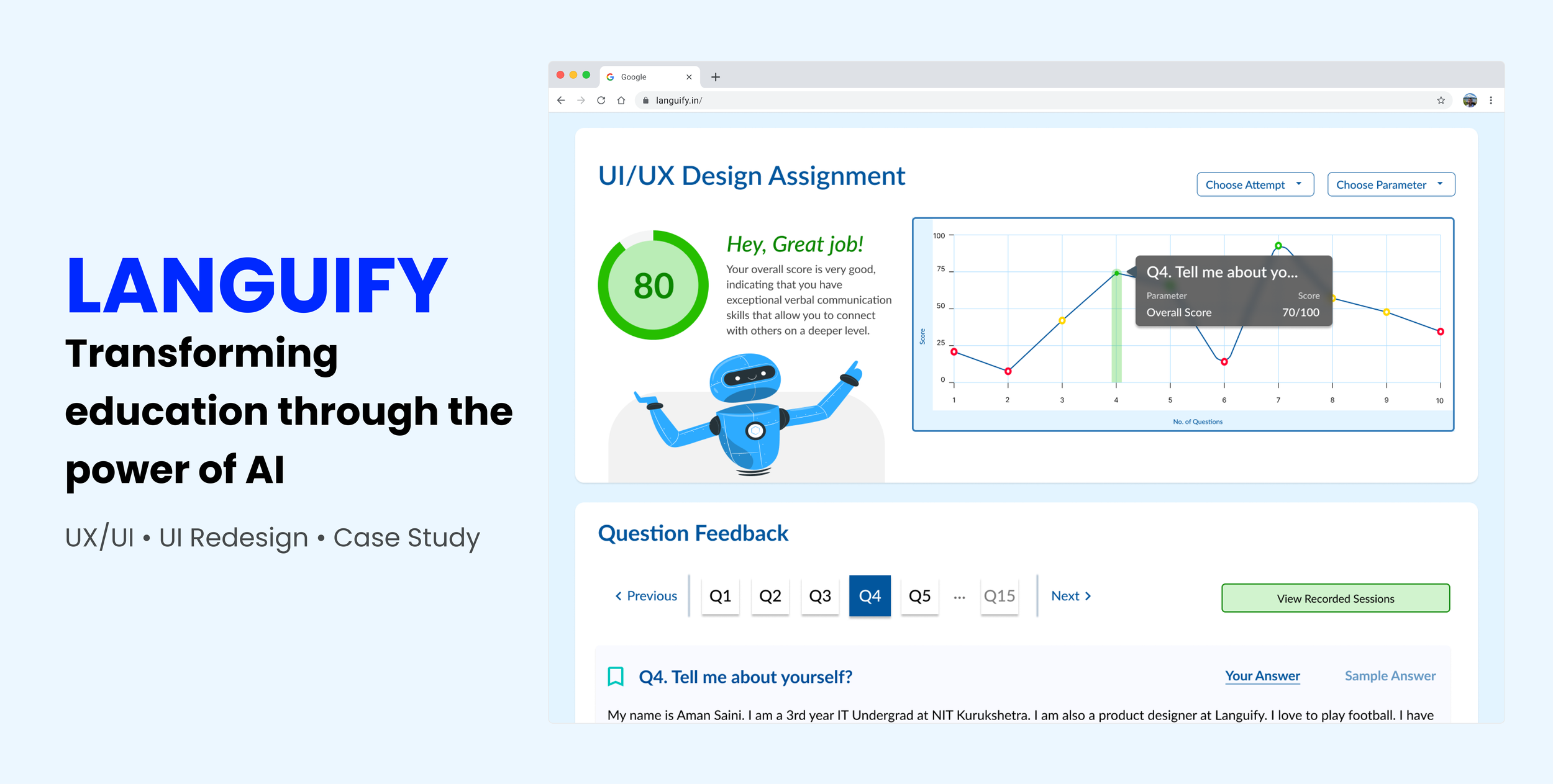
LANGUIFY AI
Transforming education through the power of AI
Languify is an EdTech startup company based in India dedicated to enhancing communication-driven educational outcomes and effectiveness for educational enterprises. The company harnesses the power of artificial intelligence to a virtual assistant which offers personalized and constructive feedback to enhance students' communication and core concept skills, while also simplifying the grading process to provide educators with greater efficiency.
In this project, we iterated on Languify’s student-facing user interface based on research to be more user friendly and aligned with their company branding.
ROLES & RESPONSIBILITIES: UX/UI Design, Research, Usability Testing
PROJECT CONTEXT: Contracted Project
TEAM: 4 UX Designers
DURATION: 4 Weeks (Fall 2023)
TOOLS USED: Figma, G Suite, Zoom
PROBLEM
The current user interface on Languify’s student facing platform is unpolished.
As Languify continues to develop the student-facing side of their platform, their existing screens needed to be reviewed to identify areas of opportunity and improvement. Based on user feedback, students were having trouble tracking their progress effectively because the user interface was too confusing and overwhelming to navigate.
SOLUTION
Conduct usability testing to gather feedback and iterate based on feedback.
As a team, we crafted a research plan and conducted usability testing with several users for feedback on usability issues. I also researched competing platforms to analyze their current solutions before iterating on the user interface to make it more user friendly, visually appealing, and also better align with Languify’s branding.
USABILITY TESTING
The user interface is too overwhelming when looking for information and too distracting when completing an assessment.
I created a screener survey and a usability testing script for testing the student assessment flow for usability issues. Our team conducted moderated usability testing with 3 participants due to time constraint and scheduling conflict. During this evaluation, we found that users were generally confused about specific functionalities. This confusion was attributed to the lack of clear hierarchy in the interface and the crowded analytics and statistics which made it overwhelming for users to navigate.
USER NEEDS
Based on user interviews, users want to have…
PERSONALIZED AI FEEDBACK
Students want to be able to access personalized feedback from the AI in order to improve on their communication and English speaking skills.
PERFORMANCE COMPARISON
Students desire clear indication of their standing within the class and their average score to better understand their performance compared to their peers.
EFFECTIVE PROGRESS TRACKING
Students find it overwhelming when there is a lack of comprehensive parameter-wise analysis, making it difficult for them to identify specific areas of growth.
INTUITIVE VISUAL REPRESENTATIONS
Students would like to have intuitive, clear visual representation of all learning parameters to interpret their performance data more easily.
Student Dashboard (Before)
Student Dashboard (After)
USER INTERFACE EVALUATION & ITERATION
Our team collaborated on reviewing existing screens to identify potential usability issues and visual inconsistencies. Overall we found that there was a lack of clear visual hierarchy and much of the AI feedback was overwhelming and confusing to look at. We revised the UI to be more intuitive and less overwhelming by decreasing visual clutter and establishing a clear visual hierarchy.
Assessment / Interview Screen (Before)
Assessment / Interview Screen (After)
Performance Analytics (Before)
Performance Analytics (After)
Bookmarks (Before)
Bookmarks (After)
Blogs (Before)
Blogs (After)
CONCLUSION
Things I learned and what I would do next time…
Building on Existing Design
This project provided me with an opportunity to build off of existing design systems and I learned how important it is to reinforce the importance of consistency in design. I learned the need to adhere to brand guidelines, which helps to maintain a strong and recognizable brand identity. Having the opportunity to revamp an existing website also reinforced the idea that design is an ongoing process and that continuous feedback and refinement are essential for a successful user experience.
Communication and Collaboration
In this UX design project, the power of effective communication and collaboration brought out some great ideas that served as the linchpin of our success. Regular team meetings and open channels for dialogue allowed for the seamless exchange of ideas, resulting in a design that beautifully balanced aesthetics and functionality. This experience reinforced that effective collaboration among designers is at the heart of creating successful user experiences.
Thank you for reading! 📖
If you have any questions for me or about my work, feel free to reach out at lilyfn19@gmail.com.

