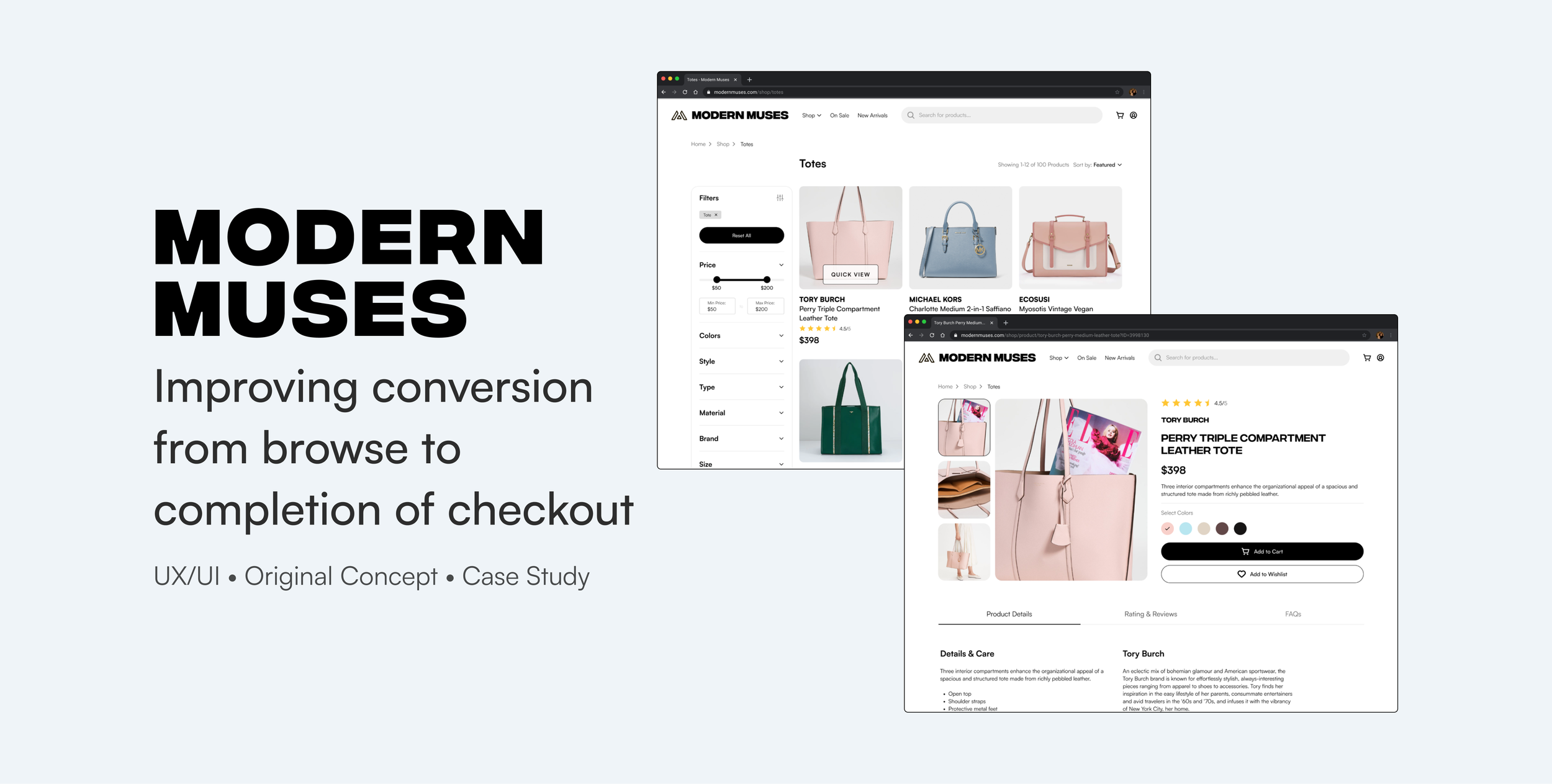
MODERN MUSES
Improving conversion from browse to completion of checkout
Modern Muses is a company that sells bags on their desktop e-commerce website. They need to enhance their browsing and checkout experience to greatly improve their product’s usability and increase revenue.
ROLES & RESPONSIBILITIES: Research, UX/UI
PROJECT CONTEXT: Conceptual project
DURATION: 1 Month (Summer 2023)
TOOLS USED: Figma, LucidChart, Zoom
PROBLEM
High rate of shopping cart abandonment and low conversion rate.
Recent data shows that 50% of users open on average 7 product pages and then abandon the site without moving any items into the cart. Additionally, 70% of users who place an item in the cart do not make a purchase. Data shows that users abandon the cart at the registration page. Right now, users must make an account to purchase.
SOLUTION
Easy product comparison and option to checkout without an account.
Forced account creation is often a reason for cart abandonment and users may also abandon a website if they do not have sufficient information to help them decide what to purchase. Providing a way for users to easily compare products before adding to cart and providing an option to checkout as a guest will improve conversion.
SECONDARY RESEARCH
Optimize the checkout process by providing multiple options and maximizing user control.
43% of consumers prefer to checkout as a guest and only 28% of consumers prefer to create an account.
36% of consumers would abandon an online purchase if forced to create an account.
86% of online consumers sometimes feel forced to provide personal information while 72% provide fake demographic information.
COMPETITIVE RESEARCH
SOLUTION IDEATION
First, I mapped out the steps that a user would take through product browsing and checkout.
Then, I brainstormed and sketched out a few of the critical screens required in the flow.
USABILITY TESTING & IMPROVEMENTS
There were 3 major improvements in my design after 2 rounds of usability testing with 5 participants each round to gather feedback and discover potential usability issues.
FINAL MOCKUPS & PROTOTYPE
THE STYLE GUIDE
CONCLUSION
Things I learned and what I would do next time…
Don’t reinvent the wheel.
I’ve learned through this project that you don’t have to reinvent the wheel and that it’s okay to stick with what everyone else is doing sometimes. While it’s fun and good to think outside of the box, some things are done a certain way because it has already been optimized and there is no reason to waste time and reinvent something that already works.
It’s the little things sometimes.
It’s not enough that a product works; it should feel fun and natural to use. Something as simple as triggering an effect when you hover over a button or a small when you click on an element can make a product feel more delightful to use. Even if it takes more effort behind the scenes, the results are often worth it.
Thank you for reading! 📖
If you have any questions for me or about my work, feel free to reach out at lilyfn19@gmail.com.


